Calantic.com Redesign: Creating Clarity in Complexity
Finding Alignment in a Tightly Scoped Brief
When Bayer’s Radiology division approached us to redesign the homepage of calantic.com, the initial brief was defined in narrow terms: stay light on visual change, follow the brand guidelines, and keep it Drupal-friendly. Our first round reflected this restraint. But behind the scenes, expectations were shifting—and once we aligned, so did the project.
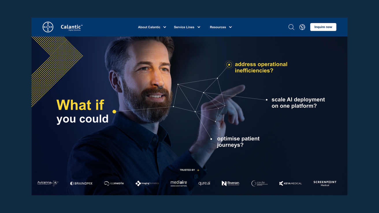
What began as a minimal refresh became a clear repositioning. One focused on inviting action, not just showing information.
Designing Familiarity, Executed with Purpose
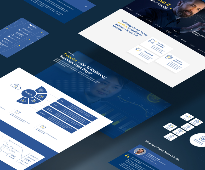
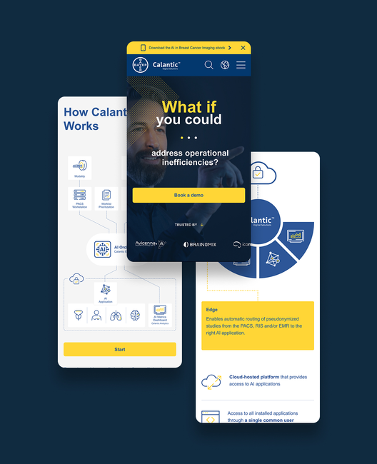
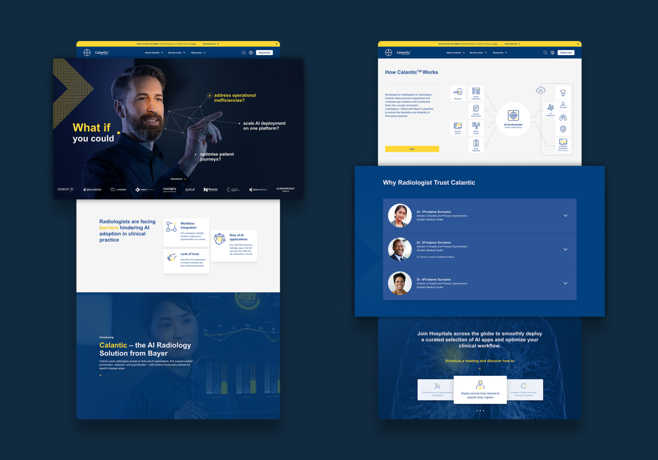
Through multiple iterations and reference-based dialogue, we uncovered what the client truly needed: a homepage that felt modern, clean, and purpose-driven, without losing recognizability. Once we understood their preferences, we introduced a redesigned structure that emphasized user flow, performance, and one clear CTA:
Schedule a conversation.
Subtle animations and interaction cues gave the site a sense of sophistication, while respecting technical constraints within the Drupal Website Factory system.
Why It Worked
The new homepage didn’t shout. It guided. It delivered just enough interaction to feel alive, and just enough restraint to remain dependable. And most importantly, it helped position Calantic’s AI-enabled digital radiology solutions as the future of connected care—one meeting at a time.